Words Matter—Online Advertising Copy
- Published: May 06, 2014, By Stephanie Millman
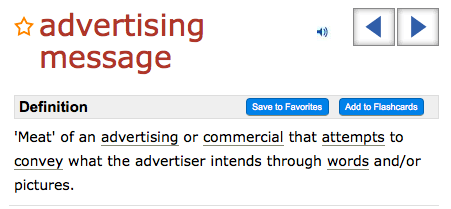
 Once you’ve nailed the visual part of your ad, the text or “copy” becomes the key to success for your online advertising investment. The text commonly has two objectives.
- Provide a clear direction telling the customer what will happen if they click on your ad.
- Give the potential customer a take away from your message if they choose not to click on it.
Just remember to focus on one benefit and get your offer/brand message across. Messages with multiple ideas, benefits or features lists may confuse the consumer or make them work too hard to get your concept.
If you’ve accomplished the creative design part of the online ad correctly, then you have the opportunity to pull your viewer in with the copy. Sell them on your product or service with few words and earn their click (or time in reading your message). To write effective ad copy, I recommend using the famous copywriting formula AIDA.
(A)ttention: While your image/design will grab initial attention, you need an attention-grabbing headline to pull them in. A strong headline or provocative question will capture attention and boost response.
(I)nterest: Use your primary benefit to get the user interested. It takes a lot of time to write only a few words that pull potential customers into your ad. The text you write should be very authentic, clear and targeted to the demographic of the website that is displaying your ad. ?
(D)esire: The copy is where you create a desire for the viewer to have an immediate interest in learning more so provide a discount or offer (case study download, extended warranty). Be straightforward and clear about what you are offering… While vague copy may increase your response rate, it could negatively impact both your conversion rates and your brand.
?(A)ction: If you have created the correct desire, the user will want to take action. This is your big opportunity to provide them with a path to take action… a click to provide their information, a phone number to call, a website to visit. Please, please, please create a special web/landing page for your viewer to land on. So many companies simply direct their ads to their homepage and completely lose the opportunity to capture a new prospect. It’s disappointing to the potential customer and tragic for your ROI of your ad!
You probably have a lot that you want to fit into the small space of an ad, but keep writing it out until you find a succinct message that ties with the imagery. Just remember to focus on one benefit and get your offer/brand message across. Messages with multiple ideas, benefits or features lists may confuse the consumer or make them work too hard to get your concept. Keep it simple, be clear and lead them to action.


