


Online Advertising Design
- Published: March 12, 2014, By Stephanie Millman
To continue our series on effective online advertising, let’s talk about creative. In the manufacturing industry, this is an oft-overlooked (and undervalued) part of the equation. Get it right, and you get even more leverage out of your marketing investment. Get it wrong, and you may as well not run the ad at all.
Before we begin, it’s important to note that there are very few marketing communications designers in our industry so it is highly recommended that you outsource your creative, but provide strong guidance. Unless you can collaborate on this effectively, you will either have a great message and content without captivating imagery OR have a beautifully designed ad that does nothing to connect the reader to your message (both scenarios will undermine your attempts to capture more business).
 Here are some quick tips you can use for your creative.
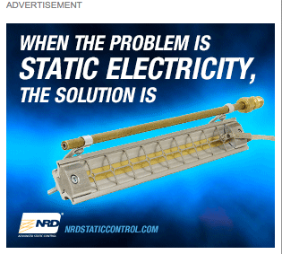
Images - Use bright, clear images. Be careful when using stock photography as it could be used too often online and not be unique to you. Or worse, be so bland that it’s not meaningful at all (cue the photo of a nice man answering the phone or shaking a hand at a trade show). Also, make sure you have the copyright authorization for any photos or artwork you use. The images you select will represent you and your brand so make sure the they connect with what you are trying to accomplish and is cohesive with other visuals in your current campaigns.
Text - Your text should be large enough to quickly read and to the point. We’ll cover this in more detail next month, but here’s a quick tip: Use the great advice of Mark Twain who said “I didn't have time to write a short letter, so I wrote a long one instead.” Take the time to make sure you are saying what you need to, then cut the available words in half and rewrite.
Color - As for color and animation, please always consider the environment. A little animation is great but if there are a lot of other ads on the same page with animation, the page becomes irritating for the viewer and all of the messages become ‘noise’ (think Las Vegas slot machines). In this case, a simple, solid ad could be the difference that sets you apart from the other ads begging for your prospects attention.
Size - The size of your ad is very important as the more advertising space you take, the more likely it will be seen but you can still get a lot of exposure by placing small ads. Even a well-designed thumbnail ad placed in a strategic location on a web page that your target audience reads is going to get good exposure for your brand. One big warning though is to make sure your ad is designed for the space in which it will be placed. Have you ever seen an ad that is not centered or has text that ‘disappears’ at the bottom?
Ideally your campaign should have two or three ads with similar messages targeting your audience. Don’t run them all at the same time in the same environment but filter them through and then track your results and evaluate which ones provide the most impressions or clicks (depending on what you are measuring). If you are measuring clicks and have a captivating image with a powerful message and enticing call-to-action then you should aim for around 0.05% of impressions.
Stay tuned for the next online advertising topic about how to write the text for your online ads.