


PPC Awards | Ellis Group Honored for Stunning Family of Cartons
- Published: October 10, 2015
Paperboard Packaging Council bestows 2015 Package of the Year for Toblerone gift cartons.
The Paperboard Packaging Council, Springfield, MA, announced the winners of its North American Paperboard Packaging Competition at an awards banquet on October 8 during its 2015 Fall Meeting and Leadership Conference. The meeting took place at the Westin in Indianapolis, IN.
Here is a look at the top prize winners.
Paperboard Package of the Year
- The Ellis Group
- Toblerone One by One Gifting for FX Creative/Mondeléz Canada
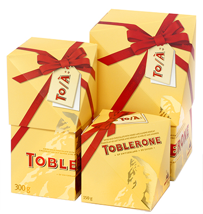 This stunning family of cartons represents a radical departure from Toblerone’s previous package designs, yet remains true to brand. In fact, the arresting structures and angular planes embody the company’s tagline: “Born to be deliciously different.”
Designed as a gift that does not require rewrapping, the graphics feature a ribbon that flows seamlessly between lid and bottom. The cartons are also right-sized to eliminate the need for wasteful false bottoms or void fillers, and they’re optimized for efficient pallet configuration.
They do everything a carton should: drive sales and breathe new life into brands by way of innovative structures and exquisite graphics while providing supply chain efficiencies and waste reductions.
Folding Carton of the Year
- Bert-Co Industries Inc.
- GlamGlow Flashmud
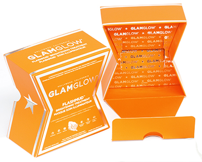 Dynamic and striking, this folding carton entices consumers at first sight with its distinctive “X” shape, bright orange printing, and the look of an upscale rigid box. Picking up the pack, consumers feel its luxurious soft touch coating and notice the glimmer of its fine detail foil stamping. At home, after removing the lid, they’re delighted to see the signature “hello sexy” panel, under which the product is inset into even more coated, foil stamped board.
Providing an immersive brand experience from store shelf to unboxing and beyond, this carton clearly demonstrates paperboard’s limitless marketing capabilities—it’s a pack you simply can’t put down.
Rigid Box of the Year
- Taylor Box Co.
- HBO Influencer Kit
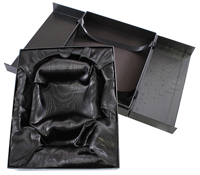 Taking influence from HBO’s acclaimed action drama Game of Thrones, this rigid box adds a dramatic flare to the unboxing experience: ribbons, secured under the interior hinged lids, lift the inner tray upon opening—adding movement and putting the contents on a “pedestal.” Upon re-closure, the tray slides inward while hidden edge magnets seal the box with a crisp snap.
The box’s unique structural elements, alongside its silkscreened and foil-stamped exterior, come together for a powerful presentation and an interactive user experience.
Innovation Award
- All Packaging Co.
- O.penVAPE Reserve for xpedx
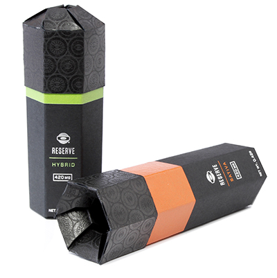 Most packaging in the new recreational/medicinal marijuana segment lacks finesse and attention to brand experience. This is not the case for this package design. Featuring a distinctive hexagonal shape and telescoping lid, these cartons provide a brand experience as unique as each “varietal” they carry.
Taking a marketing approach similar to that used for selling wine, these cartons feature thin bands of color that signify the various types of marijuana inside. Upon opening the product by lifting the telescoping lid, more of the colored panels are revealed. Best of all from an efficiency standpoint, the cartons are easy to assemble (the top panels pop into shape automatically, leaving only the bottom to be closed and locked) and pack snuggly together like puzzle pieces for shipping and storing.
Eco Award
- The Ellis Group
- Cadbury Crème Eggs 3, 6, and 12 Pack for FX Creative
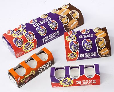 Substituting vacuum-formed plastic trays and plastic shrink sleeves with renewable, recyclable paperboard, this new design for Cadbury’s Crème Eggs is more environmentally friendly than its predecessor and allows more of the eggs’ primary packaging to show through. Furthermore, die-cuts in the bottom and top of the pack allow the cartons to nest, a smart design choice that optimizes both pallet and shelf configuration.
A new and clever twist on the egg carton you may find in your fridge, this visually impactful folding carton is sure to appeal to consumers who have a sweet tooth and a green thumb!
Judges’ AwardS
- PaperWorks Industries Inc.
- Brasseurs du Nord 6-Pack Carrier
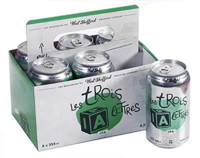 Today microbrewers are beginning to favor aluminum cans over glass bottles, but traditional paperboard beer carriers are unable to stack if they house cans. A creative and elegant solution, this craft beer carrier features a retractable carrying handle that, when lowered to can level, allows for easy stacking during transport as well as easy product access after purchase. When erect, the handle provides convenient and comfortable takeaway from the shelf.
A masterful design, this carrier is a testament to the outstanding solutions that emerge when creative design acumen meets the unmatched structural versatility of paperboard.
- WestRock
- Mixx Tails Beer for Anheuser-Busch InBev
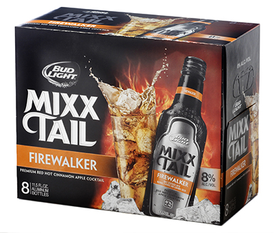 Targeted at Millennials who are looking for new and exciting cocktail refreshments, this carrier is enhanced with a metalized Unilustre coating, a technique previously unseen amongst competitors. Not only does the coating generate in-aisle stopping power, it also does not create any noticeable caliper change, thus keeping the board’s trusted tear strength and stiffness intact.
Other graphics including the vibrant splash of the cocktail in the highball glass as well as the prominent Bud Light Logo further differentiate the carton, truly bringing the brand identity to life.
- TPC?Printing and Packaging
- Chambord Black Raspberry Liqueur for Brown-Forman Corp.
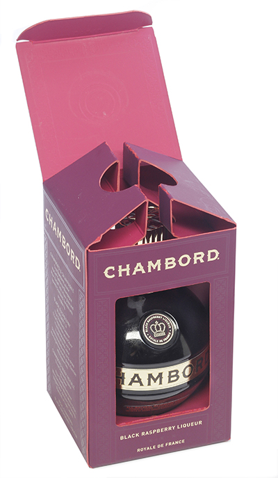 Made from special duplex purple laminated to pink vat-dyed board and featuring gold stamping and silk screening, this sumptuous folding carton perfectly captures the top-shelf elegance and luxury of the Chambord brand. The gold elements add a sense of royalty while the contrast created by the exposed pink board edges demonstrates a surprising attention to detail.
Of course, such attention goes beyond aesthetics: an incredibly sturdy package, its auto-bottom features an extension from the front panel that creates a double floor to accommodate the weight of the product. Excellence at the nexus of function and aesthetics!
For a complete list of winners, visit www.paperbox.org.